
a small NumPy project series where I try to actually build something with NumPy instead of just going through random functions and documentation. I’ve always felt that the best way to learn is by doing, so in this project, I wanted to create something both practical and personal.
The idea was simple: analyze my daily habits — sleep, study hours, screen time, exercise, and mood — and see how they affect my productivity and general well-being. The data isn’t real; it’s fictional, simulated over 30 days. But the goal isn’t the accuracy of the data — it’s learning how to use NumPy meaningfully.
So let’s walk through the process step by step.
Step 1 — Loading and Understanding the Data
I started by creating a simple NumPy array that contained 30 rows (one for each day) and six columns — each column representing a different habit metric. Then I saved it as a .npy file so I could easily load it later.
# TODO: Import NumPy and load the .npy data file
import numpy as np
data = np.load(‘activity_data.npy’)
Once loaded, I wanted to confirm that everything looked as expected. So I checked the shape (to know how many rows and columns there were) and the number of dimensions (to confirm it’s a 2D table, not a 1D list).
# TODO: Print array shape, first few rows, etc.
data.shape
data.ndim
OUTPUT: 30 rows, 6 columns, and ndim=2
I also printed out the first few rows just to visually confirm that each value looked fine — for instance, that sleep hours weren’t negative or that the mood values were within a reasonable range.
# TODO: Top 5 rows
data[:5]
Output:
array([[ 1. , 6.5, 5. , 4.2, 20. , 6. ],
[ 2. , 7.2, 6. , 3.1, 35. , 7. ],
[ 3. , 5.8, 4. , 5.5, 0. , 5. ],
[ 4. , 8. , 7. , 2.5, 30. , 8. ],
[ 5. , 6. , 5. , 4.8, 10. , 6. ]])
Step 2 — Validating the Data
Before doing any analysis, I wanted to make sure the data made sense. It’s something we often skip when working with fictional data, but it’s still good practice.
So I checked:
- No negative sleep hours
- No mood scores less than 1 or greater than 10
For sleep, that meant selecting the sleep column (index 1 in my array) and checking if any values were below zero.
# Make sure values are reasonable (no negative sleep)
data[:, 1] < 0
Output:
array([False, False, False, False, False, False, False, False, False,
False, False, False, False, False, False, False, False, False,
False, False, False, False, False, False, False, False, False,
False, False, False])
This means no negatives. Then I did the same for mood. I counted to find that the mood column was at index 5, and checked if any were below 1 or above 10.
# Is mood out of range?
data[:, 5] < 1
data[:, 5] > 10
We got the same output.
Everything looked good, so we could move on.
Step 3 — Splitting the Data into Weeks
I had 30 days of data, and I wanted to analyze it week by week. The first instinct was to use NumPy’s split() function, but that failed because 30 isn’t evenly divisible by 4. So instead, I used np.array_split(), which allows uneven splits.
That gave me:
- Week 1 → 8 days
- Week 2 → 8 days
- Week 3 → 7 days
- Week 4 → 7 days
# TODO: Slice data into week 1, week 2, week 3, week 4
weekly_data = np.array_split(data, 4)
weekly_data
Output:
[array([[ 1. , 6.5, 5. , 4.2, 20. , 6. ],
[ 2. , 7.2, 6. , 3.1, 35. , 7. ],
[ 3. , 5.8, 4. , 5.5, 0. , 5. ],
[ 4. , 8. , 7. , 2.5, 30. , 8. ],
[ 5. , 6. , 5. , 4.8, 10. , 6. ],
[ 6. , 7.5, 6. , 3.3, 25. , 7. ],
[ 7. , 8.2, 3. , 6.1, 40. , 7. ],
[ 8. , 6.3, 4. , 5. , 15. , 6. ]]),

array([[ 9. , 7. , 6. , 3.2, 30. , 7. ],
[10. , 5.5, 3. , 6.8, 0. , 5. ],
[11. , 7.8, 7. , 2.9, 25. , 8. ],
[12. , 6.1, 5. , 4.5, 15. , 6. ],
[13. , 7.4, 6. , 3.7, 30. , 7. ],
[14. , 8.1, 2. , 6.5, 50. , 7. ],
[15. , 6.6, 5. , 4.1, 20. , 6. ],
[16. , 7.3, 6. , 3.4, 35. , 7. ]]),

array([[17. , 5.9, 4. , 5.6, 5. , 5. ],
[18. , 8.3, 7. , 2.6, 30. , 8. ],
[19. , 6.2, 5. , 4.3, 10. , 6. ],
[20. , 7.6, 6. , 3.1, 25. , 7. ],
[21. , 8.4, 3. , 6.3, 40. , 7. ],
[22. , 6.4, 4. , 5.1, 15. , 6. ],
[23. , 7.1, 6. , 3.3, 30. , 7. ]]),

array([[24. , 5.7, 3. , 6.7, 0. , 5. ],
[25. , 7.9, 7. , 2.8, 25. , 8. ],
[26. , 6.2, 5. , 4.4, 15. , 6. ],
[27. , 7.5, 6. , 3.5, 30. , 7. ],
[28. , 8. , 2. , 6.4, 50. , 7. ],
[29. , 6.5, 5. , 4.2, 20. , 6. ],
[30. , 7.4, 6. , 3.6, 35. , 7. ]])]
Now the data was in four chunks, and I could easily analyze each one separately.
Step 4 — Calculating Weekly Metrics
I wanted to get a sense of how each habit changed from week to week. So I focused on four main things:
- Average sleep
- Average study hours
- Average screen time
- Average mood score
I stored each week’s array in a separate variable, then used np.mean() to calculate the averages for each metric.
Average sleep hours
# store into variables
week_1 = weekly_data[0]
week_2 = weekly_data[1]
week_3 = weekly_data[2]
week_4 = weekly_data[3]

# TODO: Compute average sleep
week1_avg_sleep = np.mean(week_1[:, 1])
week2_avg_sleep = np.mean(week_2[:, 1])
week3_avg_sleep = np.mean(week_3[:, 1])
week4_avg_sleep = np.mean(week_4[:, 1])
Average study hours
# TODO: Compute average study hours
week1_avg_study = np.mean(week_1[:, 2])
week2_avg_study = np.mean(week_2[:, 2])
week3_avg_study = np.mean(week_3[:, 2])
week4_avg_study = np.mean(week_4[:, 2])
Average screen time
# TODO: Compute average screen time
week1_avg_screen = np.mean(week_1[:, 3])
week2_avg_screen = np.mean(week_2[:, 3])
week3_avg_screen = np.mean(week_3[:, 3])
week4_avg_screen = np.mean(week_4[:, 3])
Average mood score
# TODO: Compute average mood score
week1_avg_mood = np.mean(week_1[:, 5])
week2_avg_mood = np.mean(week_2[:, 5])
week3_avg_mood = np.mean(week_3[:, 5])
week4_avg_mood = np.mean(week_4[:, 5])
Then, to make everything easier to read, I formatted the results nicely.
# TODO: Display weekly results clearly
print(f”Week 1 — Average sleep: {week1_avg_sleep:.2f} hrs, Study: {week1_avg_study:.2f} hrs, “
f”Screen time: {week1_avg_screen:.2f} hrs, Mood score: {week1_avg_mood:.2f}”)

print(f”Week 2 — Average sleep: {week2_avg_sleep:.2f} hrs, Study: {week2_avg_study:.2f} hrs, “
f”Screen time: {week2_avg_screen:.2f} hrs, Mood score: {week2_avg_mood:.2f}”)

print(f”Week 3 — Average sleep: {week3_avg_sleep:.2f} hrs, Study: {week3_avg_study:.2f} hrs, “
f”Screen time: {week3_avg_screen:.2f} hrs, Mood score: {week3_avg_mood:.2f}”)

print(f”Week 4 — Average sleep: {week4_avg_sleep:.2f} hrs, Study: {week4_avg_study:.2f} hrs, “
f”Screen time: {week4_avg_screen:.2f} hrs, Mood score: {week4_avg_mood:.2f}”)
Output:
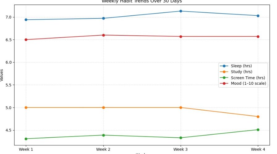
Week 1 – Average sleep: 6.94 hrs, Study: 5.00 hrs, Screen time: 4.31 hrs, Mood score: 6.50
Week 2 – Average sleep: 6.97 hrs, Study: 5.00 hrs, Screen time: 4.39 hrs, Mood score: 6.62
Week 3 – Average sleep: 7.13 hrs, Study: 5.00 hrs, Screen time: 4.33 hrs, Mood score: 6.57
Week 4 – Average sleep: 7.03 hrs, Study: 4.86 hrs, Screen time: 4.51 hrs, Mood score: 6.57
Step 5 — Making Sense of the Results
Once I printed out the numbers, some patterns started to show up.
My sleep hours were pretty steady for the first two weeks (around 6.9 hours), but in week three, they jumped to around 7.1 hours. That means I was “sleeping better” as the month went on. By week four, it stayed roughly around 7.0 hours.
For study hours, it was the opposite. Week one and two had an average of around 5 hours per day, but by week four, it had dropped to about 4 hours. Basically, I started off strong but slowly lost momentum — which, honestly, sounds about right.
Then came screen time. This one hurt a bit. In week one, it was roughly 4.3 hours per day, and it just kept creeping up every week. The classic cycle of being productive early on, then slowly drifting into more “scrolling breaks” later in the month.
Finally, there was mood. My mood score started at around 6.5 in week one, went slightly up to 6.6 in week two, and then kind of hovered there for the rest of the period. It didn’t move dramatically, but it was interesting to see a small spike in week two — right before my study hours dropped and my screen time increased.
To make things interactive, I thought it’d be great to visualise using matplotlib.

Step 6 — Looking for Patterns
Now that I had the numbers, I wanted to know why my mood went up in week two.
So I compared the weeks side by side. Week two had decent sleep, high study hours, and relatively low screen time compared to the later weeks.
That might explain why my mood score peaked there. By week three, even though I slept more, my study hours had started to dip — maybe I was resting more but getting less done, which didn’t boost my mood as much as I expected.
This is what I liked about the project: it’s not about the data being real, but about how you can use NumPy to explore patterns, relationships, and small insights. Even fictional data can tell a story when you look at it the right way.
Step 7 — Wrapping Up and Next Steps
In this little project, I learned a few key things — both about NumPy and about structuring analysis like this.
We started with a raw array of fictional daily habits, learned how to check its structure and validity, split it into meaningful chunks (weeks), and then used simple NumPy operations to analyze each segment.
It’s the kind of small project that reminds you that data analysis doesn’t always have to be complex. Sometimes it’s just about asking simple questions like “How is my screen time changing over time?” or “When do I feel the best?”
If I wanted to take this further (which I probably will), there are so many directions to go:
- Find the best and worst days overall
- Compare weekdays vs weekends
- Or even create a simple “wellbeing score” based on multiple habits combined
But that’ll probably be for the next part of the series.
For now, I’m happy that I got to apply NumPy to something that feels real and relatable — not just abstract arrays and numbers, but habits and emotions. That’s the kind of learning that sticks.
Thanks for reading.
If you’re following along with the series, try recreating this on your own fictional data. Even if your numbers are random, the process will teach you how to slice, split, and analyze arrays like a pro.
Source link


Add comment