

Some years ago, when working as a consultant, I was deriving a relatively complex ML algorithm, and was faced with the challenge of making the inner workings of that algorithm transparent to my stakeholders. That’s when I first came to use parallel coordinates – because visualizing the relationships between two, three, maybe four or five variables is easy. But as soon as you start working with vectors of higher dimension (say, thirteen, for example), the human mind oftentimes is unable to grasp this complexity. Enter parallel coordinates: a tool so simple, yet so effective, that I often wonder why it’s so little in use in everyday EDA (my teams are an exception). Hence, in this article, I will share with you the benefits of parallel coordinates based on the Wine Dataset, highlighting how this technique can help uncover correlations, patterns, or clusters in the data without losing the semantics of features (e.g., in PCA).
What are Parallel Coordinates
Parallel coordinates are a common method of visualizing high-dimensional datasets. And yes, that’s technically correct, although this definition does not fully capture the efficiency and elegance of the method. Unlike in a standard plot, where you have two orthogonal axes (and hence two dimensions that you can plot), in parallel coordinates, you have as many vertical axes as you have dimensions in your dataset. This means an observation can be displayed as a line that crosses all axes at its corresponding value. Want to learn a fancy word to impress at the next hackathon? “Polyline”, that’s the correct term for it. And patterns then appear as bundles of polylines with similar behaviour. Or, more specifically: clusters appear as bundles, while correlations appear as trajectories with consistent slopes across adjacent axes.
Wonder why not just do PCA (Principal Component Analysis)? In parallel coordinates, we retain all the original features, meaning we do not condense the information and project it into a lower-dimensional space. So this eases interpretation a lot, both for you and for your stakeholders! But (yes, over all the excitement, there must still be a but…) you should take good care not to fall into the overplotting-trap. If you don’t prepare the data carefully, your parallel coordinates easily become unreadable – I’ll show you in the walkthrough that feature selection, scaling, and transparency adjustments can be of great help.
Btw. I should mention Prof. Alfred Inselberg here. I had the honour to dine with him in 2018 in Berlin. He’s the one who got me hooked on parallel coordinates. And he’s also the godfather of parallel coordinates, proving their value in a multitude of use cases in the 1980s.
Proving my Point with the Wine Dataset
For this demo, I chose the Wine Dataset. Why? First, I like wine. Second, I asked ChatGPT for a public dataset that is similar in structure to one of my company’s datasets I am currently working on (and I did not want to take on all the hassle to publish/anonymize/… company data). Third, this dataset is well-researched in many ML and Analytics applications. It contains data from the analysis of 178 wines grown by three grape cultivars in the same region of Italy. Each observation has thirteen continuous attributes (think alcohol, flavonoid concentration, proline content, colour intensity,…). And the target variable is the class of the grape.
For you to follow through, let me show you how to load the dataset in Python.
import pandas as pd

# Load Wine dataset from UCI

uci_url = "https://archive.ics.uci.edu/ml/machine-learning-databases/wine/wine.data"

# Define column names based on the wine.names file

col_names = [

    "Class", "Alcohol", "Malic_Acid", "Ash", "Alcalinity_of_Ash", "Magnesium",

    "Total_Phenols", "Flavanoids", "Nonflavanoid_Phenols", "Proanthocyanins",

    "Color_Intensity", "Hue", "OD280/OD315", "Proline"

]

# Load the dataset

df = pd.read_csv(uci_url, header=None, names=col_names)

df.head()
Good. Now, let’s derive a naïve plot as a baseline.
First Step: Built-In Pandas
Let’s use the built-in pandas plotting function:
from pandas.plotting import parallel_coordinates

import matplotlib.pyplot as plt

plt.figure(figsize=(12,6))

parallel_coordinates(df, 'Class', colormap='viridis')

plt.title("Parallel Coordinates Plot of Wine Dataset (Unscaled)")

plt.xticks(rotation=45)

plt.show()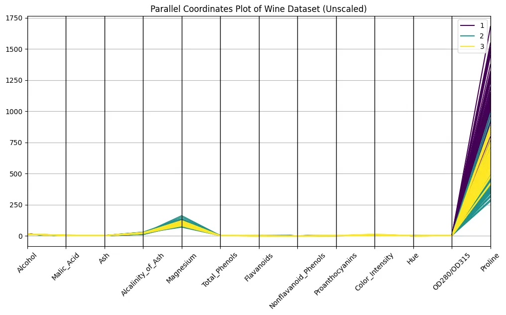
Looks good, right?
No, it doesn’t. You certainly are able to discern the classes on the plot, but the differences in scaling make it hard to compare across axes. Compare the orders of magnitude of proline and hue, for example: proline has a strong optical dominance, just because of scaling. An unscaled plot looks almost meaningless, or at least very difficult to interpret. Even so, faint bundles over classes seem to appear, so let’s take this as a promise for what’s yet to come…
It’s all about Scale
Many of you (everyone?) are familiar with the min-max scaling from ML preprocessing pipelines. So let’s not use that. I’ll do some standardization of the data, i.e., we do Z-scaling here (each feature will have a mean of zero and unit variance), to give all axes the same weight.
from sklearn.preprocessing import StandardScaler

# Separate features and target

features = df.drop("Class", axis=1)

scaler = StandardScaler()

scaled = scaler.fit_transform(features)

# Reconstruct a DataFrame with scaled features

scaled_df = pd.DataFrame(scaled, columns=features.columns)

scaled_df["Class"] = df["Class"]

plt.figure(figsize=(12,6))

parallel_coordinates(scaled_df, 'Class', colormap='plasma', alpha=0.5)

plt.title("Parallel Coordinates Plot of Wine Dataset (Scaled)")

plt.xticks(rotation=45)

plt.show()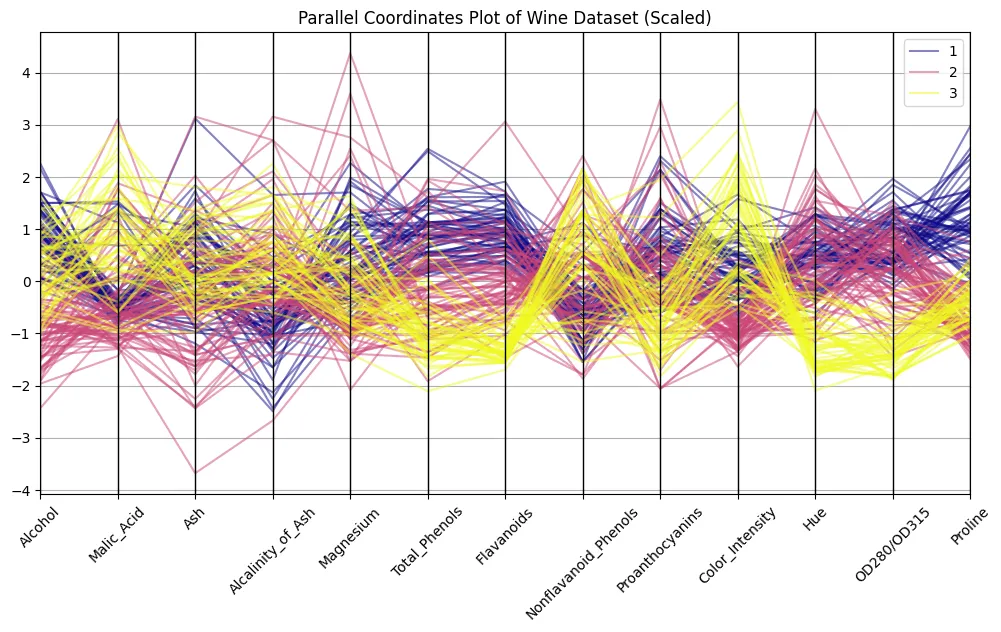
Remember the picture from above? The difference is striking, eh? Now we can discern patterns. Try to distinguish clusters of lines associated with each wine class to find out what features are most distinguishable.
Feature Selection
Did you discover something? Correct! I got the impression that alcohol, flavonoids, colour intensity, and proline show almost textbook-style patterns. Let’s filter for these and try to see if a curation of features helps make our observations even more striking.
selected = ["Alcohol", "Flavanoids", "Color_Intensity", "Proline", "Class"]

plt.figure(figsize=(10,6))

parallel_coordinates(scaled_df[selected], 'Class', colormap='coolwarm', alpha=0.6)

plt.title("Parallel Coordinates Plot of Selected Features")

plt.xticks(rotation=45)

plt.show()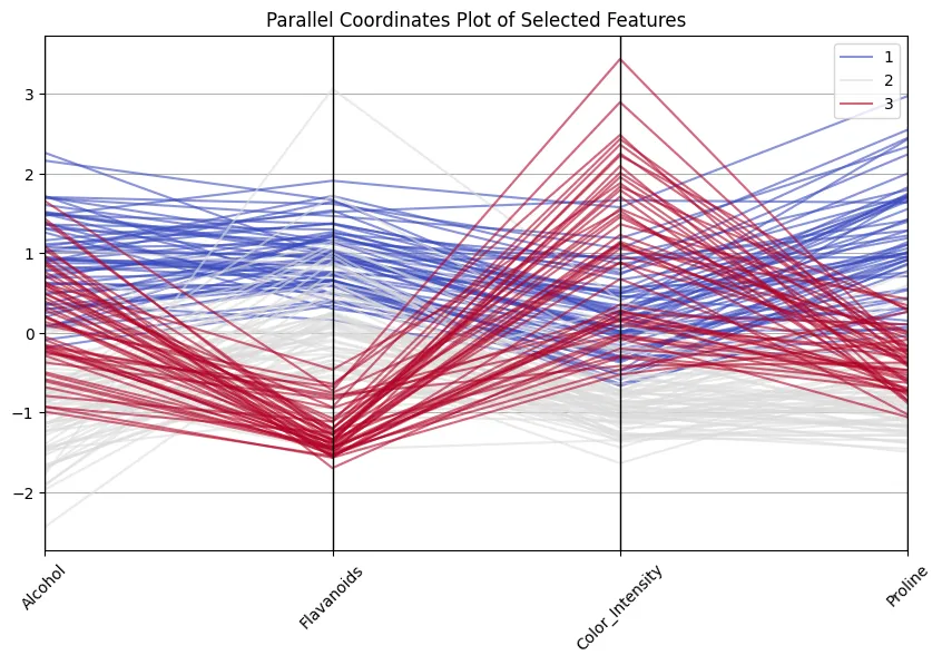
Nice to see how class 1 wines always score high on flavonoids and proline, whereas class 3 wines are lower on these but high in colour intensity! And don’t think that’s a vain exercise… 13 dimensions are still ok to handle and to inspect, but I have encountered cases with 100+ dimensions, making reducing dimensions imperative.
Adding Interaction
I admit: the examples above are quite mechanistic. When writing the article, I also placed hue next to alcohol, which made my nicely shown classes collapse; so I moved colour intensity next to flavonoids, and that helped. But my objective here was not to give you the perfect copy-paste piece of code; it was rather to show you the use of parallel coordinates based on some simple examples. In real life, I would set up a more explorative frontend. Plotly parallel coordinates, for instance, come with a “brushing” feature: there you can select a subsection of an axis and all polylines falling within that subset will be highlighted.
You can also reorder axes by simple drag and drop, which often helps reveal correlations that were hidden in the default order. Hint: Try adjacent axes that you suspect to co-vary.
And even better: scaling is not necessary for inspecting the data with plotly: the axes are automatically scaled to the min- and max values of each dimension.
Here’s a code for you to reproduce in your Colab:
import plotly.express as px
# Keep class as a separate column; Plotly's parcoords expects numeric colour for 'color'
df["Class"] = df["Class"].astype(int)
fig_all = px.parallel_coordinates(
df,
color="Class", # numeric colour mapping (1..3)
dimensions=features.columns,
labels={c: c.replace("_", " ") for c in scaled_df.columns},
)
fig_all.update_layout(
title="Interactive Parallel Coordinates — All 13 Features"
)
# The file below can be opened in any browser or embedded via 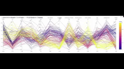
So with this final element in place, what conclusions do we draw?
Conclusion
Parallel coordinates are not so much about the hard numbers, but much more about the patterns that emerge from these numbers. In the Wine dataset, you could observe several such patterns – without running correlations, doing PCA, or scatter matrices. Flavonoids strongly help distinguish class 1 from the others. Colour intensity and hue separate classes 2 and 3. Proline further reinforces that. What follows from there is not only that you can visually separate these classes, but also that it gives you an intuitive understanding of what separates cultivars in practice.
And this is exactly the strength over t-SNE, PCA, etc., these techniques project data into components that are excellent in distinguishing the classes… But good luck trying to explain to a chemist what “component one” means to him.
Don’t get me wrong: parallel coordinates are not the Swiss army knife of EDA. You need stakeholders with a very good grasp of data to be able to use parallel coordinates to communicate with them (else continue using boxplots and bar charts!). But for you (and me) as a data scientist, parallel coordinates are the microscope you have always been longing for.
Frequently Asked Questions
A. Parallel coordinates are primarily used for exploratory analysis of high-dimensional datasets. They allow you to spot clusters, correlations, and outliers while keeping the original variables interpretable.
A. Without scaling, features with large numeric ranges dominate the plot. Standardising each feature to mean zero and unit variance ensures that every axis contributes equally to the visual pattern.
A. PCA and t-SNE reduce dimensionality, but the axes lose their original meaning. Parallel coordinates keep the semantic link to the variables, at the cost of some clutter and potential overplotting.
As the CDAO at Fischer, I am a seasoned professional with over 15 years of experience in the field of data science. With a Ph.D. in economics and five years of experience as an Assistant Professor for Economic Theory, I have developed a deep understanding of social norm compliance and its impact on decision-making.
I am also a renowned conference speaker and podcast participant, sharing my expertise on a wide range of topics related to data science and business strategy. My background includes working as an A.I. Evangelist for STAR Cooperation and in strategy and management consulting with a focus on after-sales pricing. This experience has allowed me to develop a broad skill set that includes data science, product management, and strategy development.
Before my current task, I was responsible for managing a large Data Science Center of Excellence at E. Breuninger, where I led a team of data scientists and product managers. I am passionate about leveraging data to drive business decisions and achieve tangible results, and I have a proven track record of success in this area.
With a deep knowledge of economics, psychology, and data science, I am looking forward to professional exchanges with any organization looking to drive growth and innovation through data-driven insights.
Login to continue reading and enjoy expert-curated content.
Source link


Add comment